Digital clock for Chrome, with world time
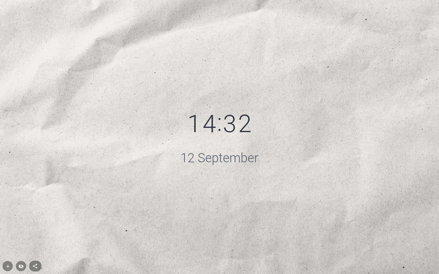
A clock for Chrome that isn’t eleven pixels tall in the corner of your screen. It lives on the new tab, as big as you like, in any of 22 fonts, and if half the team is in another time zone it’ll show their time too.
Twelve formats, previewed live
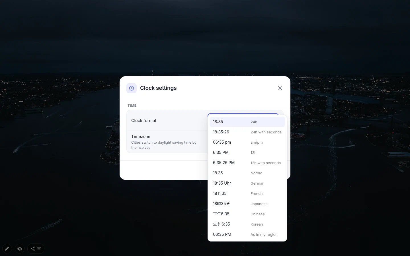
Open Clock settings and every entry in Clock format is shown on the current time, so you choose by looking. 24-hour is the default. Next come 24-hour with seconds, am/pm, 12-hour and 12-hour with seconds, then the regional styles: Nordic 18.35, German 18:35 Uhr, French 18 h 35, Japanese 18時35分, Chinese and Korean.
As in my region follows your browser’s language rather than the extension’s. British English gets 24 hours, American English gets 12. Small thing, saves an argument.
One quirk. The am/pm format keeps the leading zero, 02:05 pm. For 2:05 PM, pick 12-hour.
A world clock in Google Chrome
The Timezone list has three groups. From my computer comes first, then 99 cities that switch to daylight saving by themselves, then 37 fixed offsets from UTC. Choose London, Edinburgh — the city, not an offset — and the clock follows British Summer Time. It keeps the right time even in the hour your computer changes its clocks.
For a world clock, line up three of them and put a text widget under each with the city. Time zones are free on this clock. Just remember that three clocks plus three labels make six widgets, and the free plan lets you add three yourself (widgets from an installed theme don’t count).
Big is the whole idea
There is no font-size box. Drag the corner and the digits grow with the frame, from a corner readout to half the screen. Change the format and the frame refits itself, so adding seconds doesn’t push into the widget next door.
At large sizes the font matters more than the colour. Rubik Mono and Press Start keep their shape when they’re huge; the handwriting faces look better smaller, beside a photo.
What it does not have is designs or a vertical layout. It’s the plain text clock, and the menu calls it Text clock. For flip cards, neon or Nixie tubes there’s the animated clock, and for hands, the analog one.
Digital Clock settings
- Clock format
- 12 options, each shown on the current time. 24-hour unless you change it.
- Timezone
- Your computer’s time, one of 99 cities with daylight saving, or one of 37 fixed UTC offsets. Free on this clock.
- Font
- Any of the 22 in the toolbox. Monospace and display faces hold up best at poster size.
- Colour, fill and shadow
- Digit colour, a fill behind them and a text shadow for busy photos. Corner radius sits in the Border panel.
- Size
- Drag the corner. The frame re-measures itself after you change the format or time zone.
- Opening settings
- Double-click the clock, or use the gear in the toolbox.
What people use it for
- One huge clock in the middle of a minimal page.
- A row of clocks for a team split between New York, London and Tokyo.
- A small corner clock on a page that’s mostly links.
- A desk clock on a second monitor parked on the new tab.
- German or Nordic time formats for people who never got on with am/pm.
Put the digital clock on your new tab
It comes with New Tab Studio. The extension is free to install and needs no account to start.
- 1Add New Tab Studio to Chrome
- 2Open a new tab, click the button at the bottom left
- 3Pick the widget, then drag it into place
Questions about the digital clock widget
How can I see clocks for several cities in Chrome?
For a quick check, search Google for “time in Tokyo”, and Windows can add two extra clocks to its taskbar clock under Date & time settings. To keep several cities on the Chrome new tab, add New Tab Studio’s text clock once per city and choose each from 99 cities in the Timezone list. Three clocks fit the free plan, while text labels under them would need PRO.
Does the clock handle daylight saving time?
Yes, the digital clock switches to daylight saving time by itself whenever you pick a city, and all 99 cities in the list do. Only the 37 fixed UTC offsets at the bottom stay put, and older themes built with offsets keep them. It even shows the right time in the hour your computer changes its own clock.
How do I put a clock on the Chrome new tab page?
Chrome’s standard new tab page has no clock option, so a clock there comes from an extension. In New Tab Studio, Text clock lives under Time in the widget menu, reached from the button in the bottom-left corner. Drag its corner until the digits are as big as you want, and double-click it for formats and time zones.
How do I get 2:05 PM instead of 14:05?
Pick 12-hour in Clock format and the clock writes 2:05 PM, or 12-hour with seconds if you want those too. The am/pm option keeps the leading zero, 02:05 pm. As in my region decides by your browser’s language, so British English gets 24 hours and American English gets 12.
Do time zones cost extra on the digital clock?
No, the time zone on the text clock is free, and so are all 12 formats. The analog clock is the only one where another city needs PRO. What the free plan does limit is how many widgets you add by hand, and that number is three.
Widgets that pair well with it
See the full widget catalogue or browse themes other people have built.